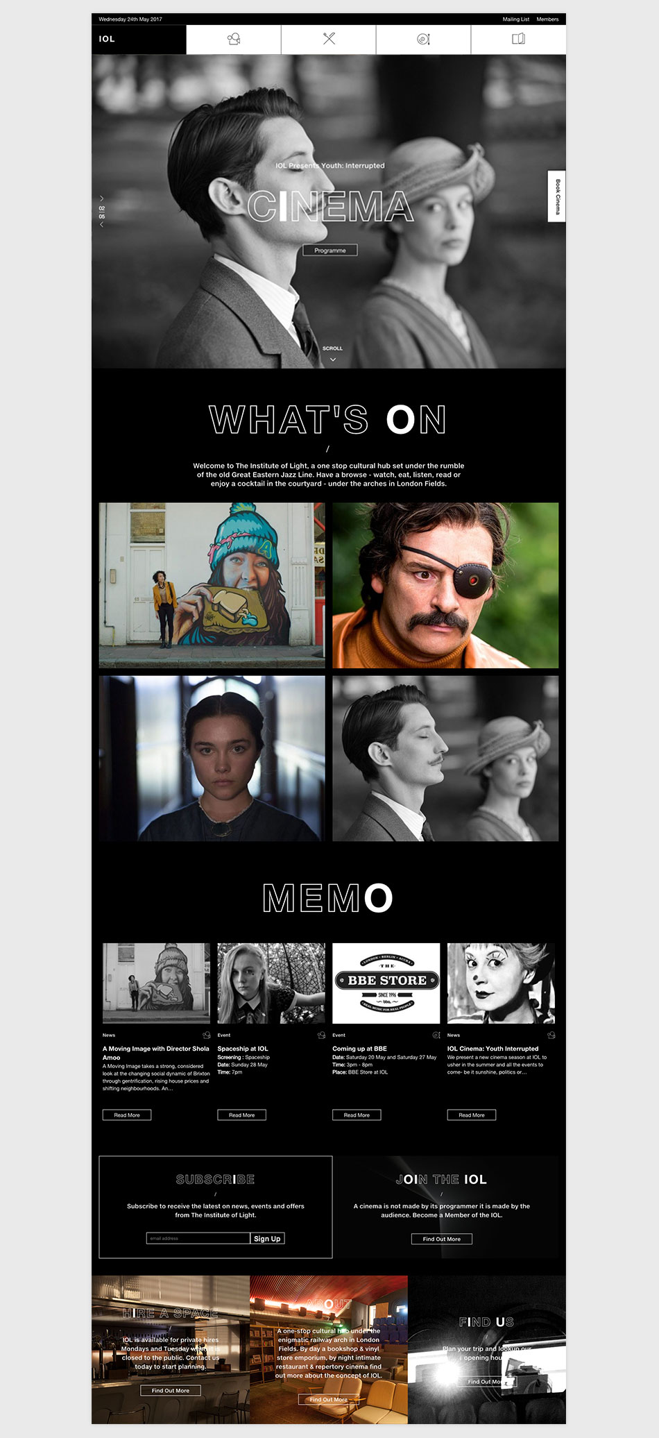
The Institute Of Light is Hackney’s newest collaborative space – a one-stop cultural hub set in an enigmatic railway arch and intimate courtyard under the rumble of the old “Great Eastern Jazz Line” IOL works as a multi-sensory space; a repertory cinema; vinyl record store; film, music and photography bookshop, and social cafe – all under one roof
Above: the Logo and it two applications
Above: Icons design for each area with IOL: Watch / Eat / Listen / Read
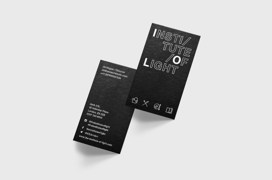
Above: business cards design, printed on 800gsm uncoated stock, triplexed using 250gsm x 2 black stock and central white stock 300gsm.
Print Materials
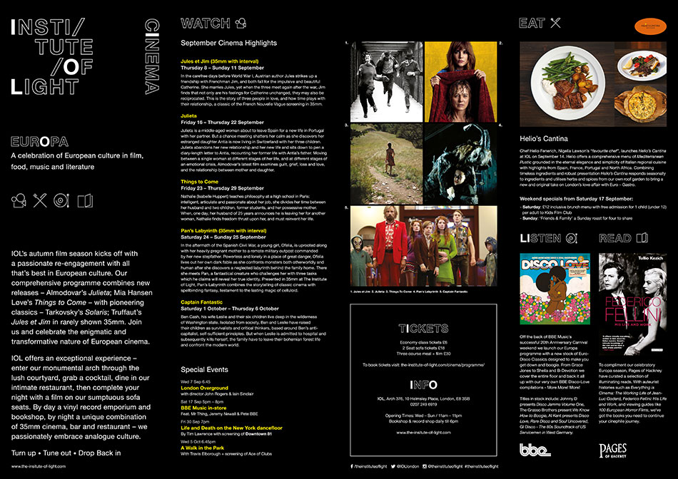
We also produced a range of print materials, including regular programmes and fliers for specific events that were placed in local galleries, coffee shops, libraries, community centres, doctor’s surgeries and laundrettes, to reach Londoners of all backgrounds.
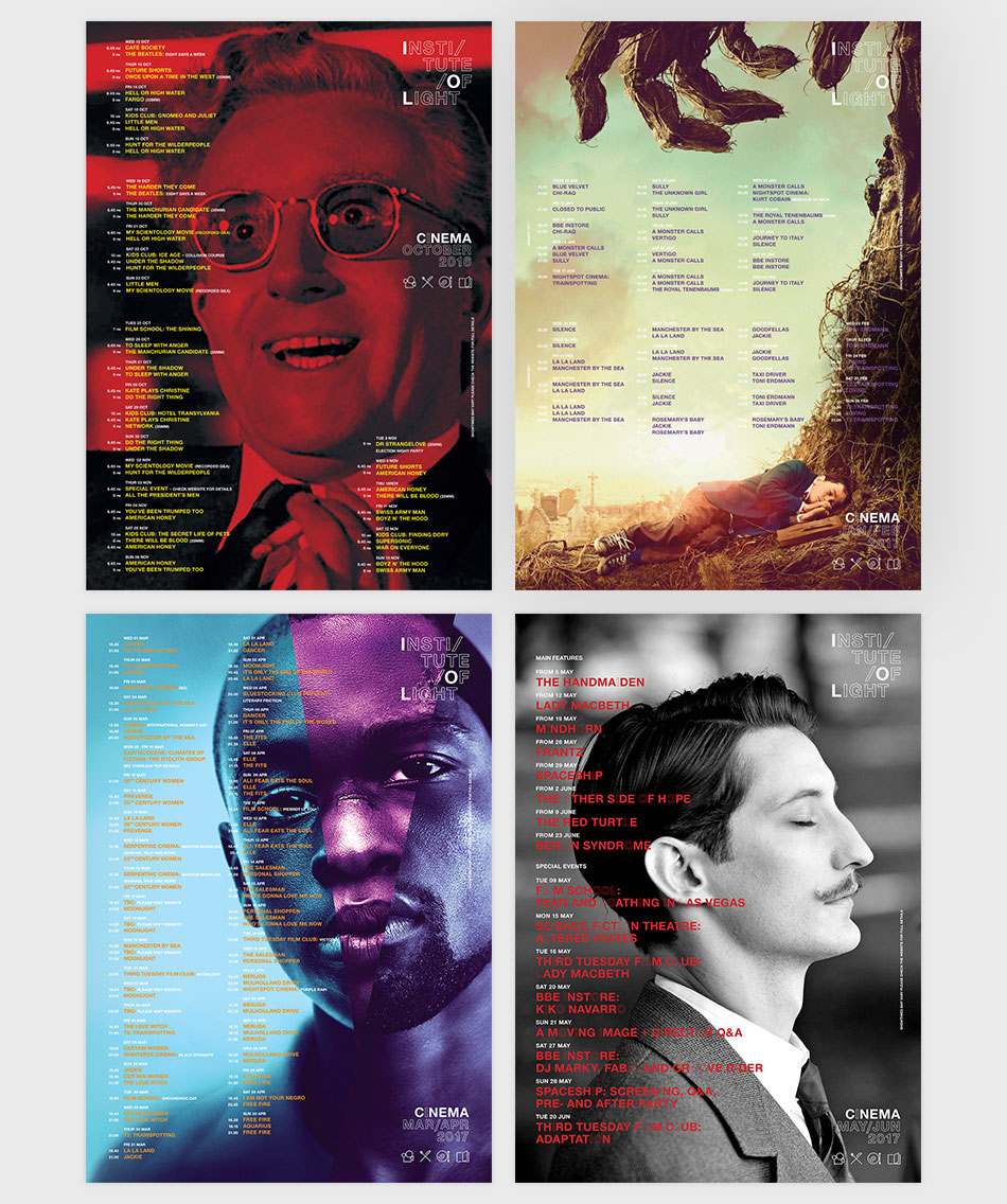
Above: A3 folded programmes
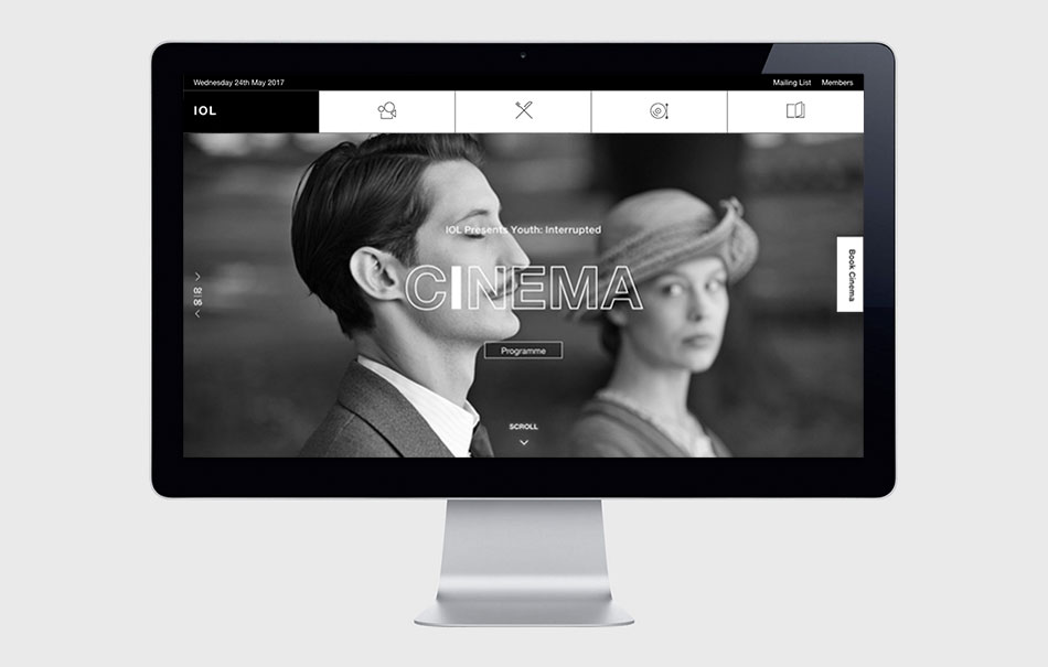
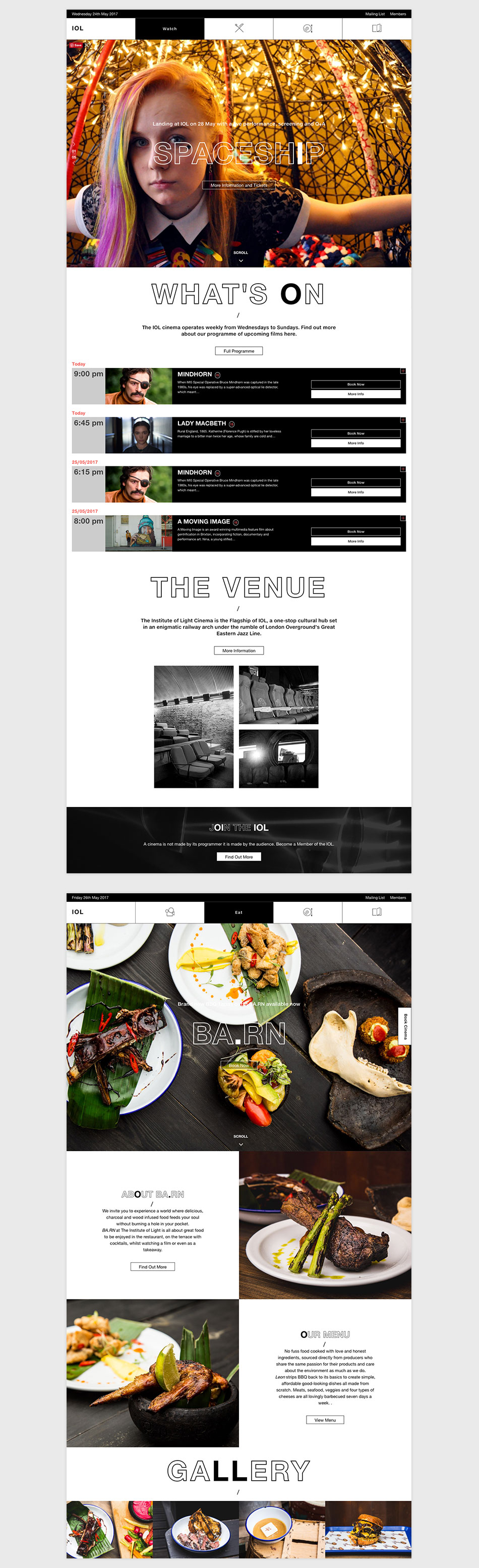
Fruitmachine had just under two months to design the identity and establish its roots quickly. With the Institute of Light being a such exciting new addition in Hackney, we didn’t want to lost the momentum generated from the anticipation in the local area. So we hit the ground running and quickly locked on to the initials IOL, mainly because we thought the name Institute Of Light was too long, although we don’t batter an eyelid about it now, but what became obvious was that this could become a typographic device we could use across all design applications, highlighting the I, O, L in signage, menus, posters and online. This went a long way to reinforcing the message that IOL was synonymous and encapsulated every aspect of the project.
The titles Watch / Eat / Listen / Read were our way to brand the cinema, restaurant, record shop and library without having to be so literal about it.
Branding: logo, Stationary, programmes, adverts, promotional materials
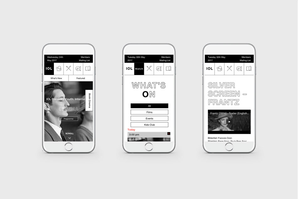
Website: Full site design, build and functionality development, MySQL, PHP, WordPress, AJAX, Javascript