Resi Company’s purpose is to improve the quality of living spaces in Greece. We are doing so by acquiring older properties and redesigning internal and external areas, upgrading material, technological and energy features and creating spaces for contemporary living in Athens.
We partnered with Resi Company to create a strong identity and website to define a clear proposition in the Athens property market. We developed a flexible brand identity that could communicate the contemporary lifestyle around the Resi ideology.
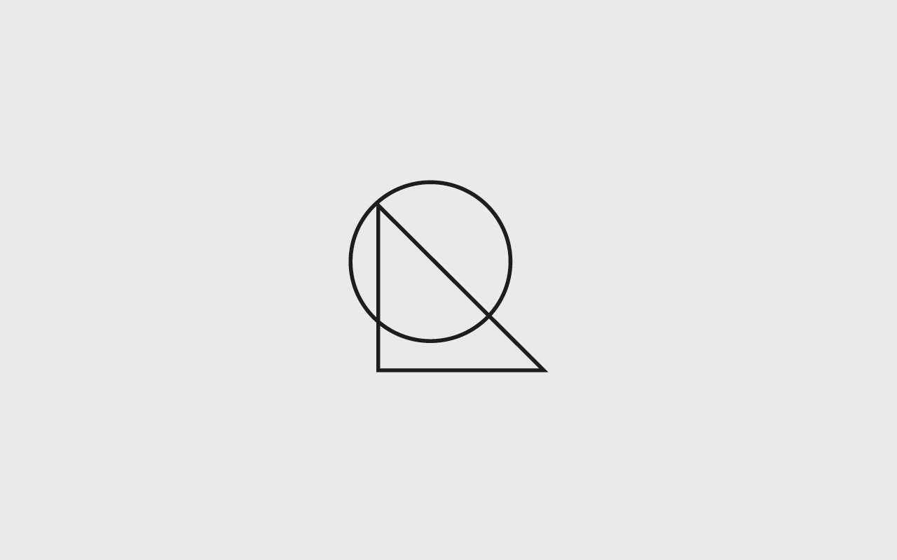
Fruitmachine set out to craft an identity that could communicate the area Resi operates in and also the type of business. After various explorations, we focused on a graphic ‘R’, breaking it down into 2 geometric shapes: 1. Circle = Area 2. Triangle = Living. The circle represent the working area of Athens, and the triangle symbolises the roof, living. Together this formed our graphic ‘R’ and our brand mark.
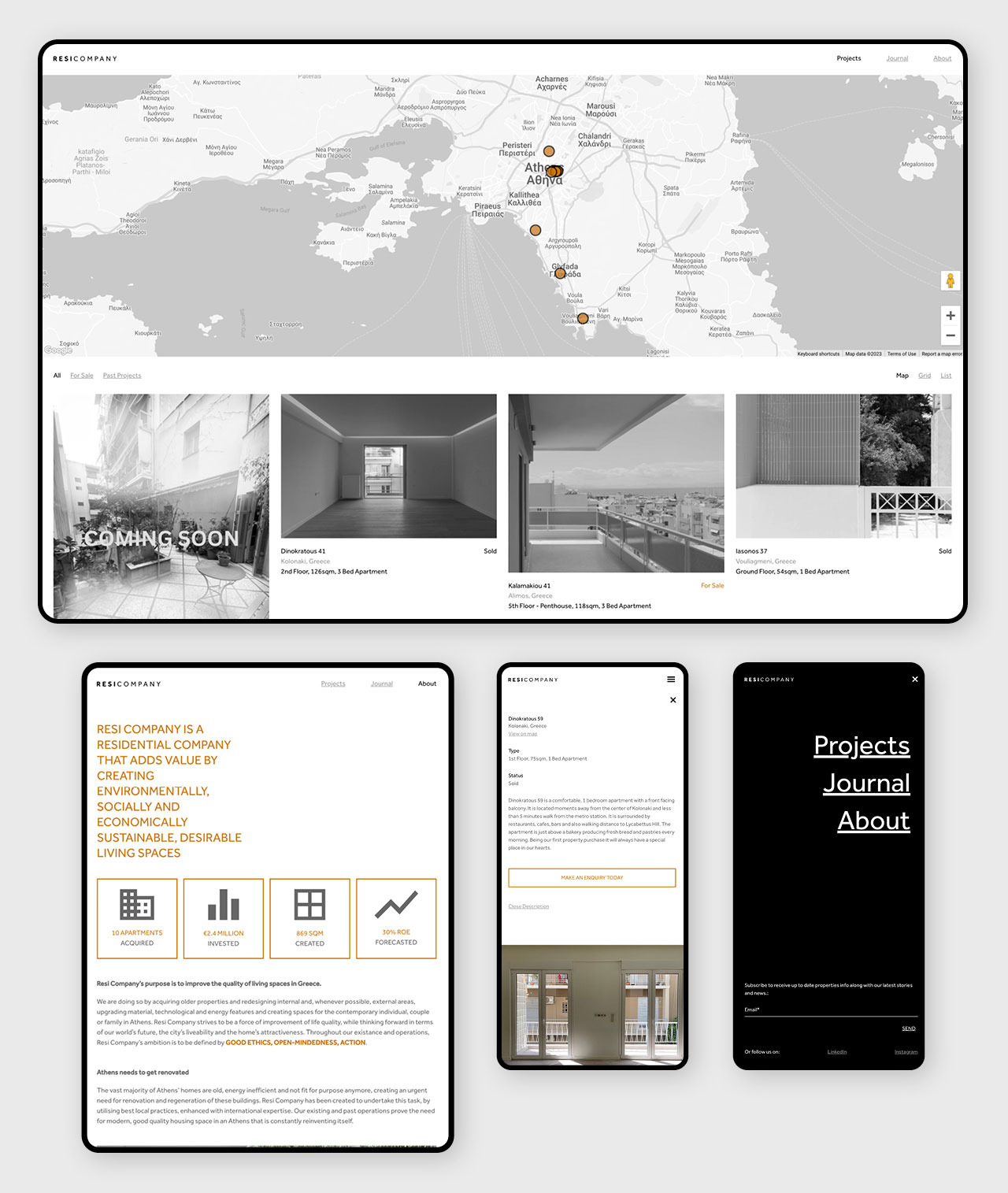
We approach the website design with a minimalistic approach to keep the design slick and uncomplicated. we used colour overlay on a masonry grid, with a list and map view, each leading to individual property portfolios.
Branding, Positioning
Website architecture and concept, full site design, build and functionality development
CMS, MySQL, PHP, WordPress, AJAX, Javascript
Click the link to visit the website: www.resicompany.com